
 by Jiyambi
This guide is designed to teach you to create maps (and any other graphic) using the free image editor, GIMP. GIMP is a lot like Photoshop, though not as smooth or polished, but it is free. It allows you to do many nifty things like transparency, shadow, and outlines.
This is intended to be a collection of tips pertinent to guide writers for WoW-Pro.com. I know there are a lot of other cool things GIMP can do, but please only share tips that are useful for this site. You can share tips by leaving a comment (Jiyambi or another editor can add your tip for you).
Table of Contents
- Downloading and Installing GIMP
- Getting the Source Image
- The Basics of GIMP
- Removing Backgrounds
- Adding Notes
- Adding an Outline
- Adding a Drop Shadow
Downloading and Installing GIMP for Windows
As I noted above, GIMP is a free graphics manipulation program. You can download it from it’s website, http://www.gimp.org/. Note that this procedure can also be used to update an older version of GIMP.
- Go to http://www.gimp.org/ and click “Download” in the top banner.
- The newest version should be listed near the top, click the link on that page to start the download.
- Once the file downloads, open it to start the installation. It’s best to exit other programs before doing this. Click “Run” if Windows needs your confirmation.
- Once the GIMP installer opens, follow the following steps:
- Click “Next”.
- Click “Next”.
- Click “Install Now”.
- The program will now install GIMP. If you had an older version of it on your computer, it will automatically remove that version and install the new one.
- Once it’s done, uncheck “Launch GIMP” and click “Finish”.
Getting the Source Image
Now that you have GIMP installed, you need to get some images to edit! Some obvious places to find these are screenshots you take yourself in game. You can also find maps using sites such as WoWhead, though remember to always give credit to the site where you found your source image, and ask permission first if possible.
Taking a Screenshot
Taking a screenshot in game is very easy – simply hit your keyboard’s “Prt Sc” button (print screen). However, you can use some tricks to get better screenshots:
- Hide your UI (User Interface) by pressing alt and z together. This will hide all of your normal interface and any addons.
- Go to your interface options and hide character and NPC names under “display”. This will make for a more realistic looking shot, if you are taking pictures with people/mobs in them.
- Zoom all the way in to get a 1st person type view (without your character in the picture).
Once you take you shot, it will appear in the WoW screenshots folder. The screenshots are stored in a sub folder of your WoW folder. Depending on your operating system, your folder could be found:
- Windows: C:/Program Files/World of Warcraft/Screenshots
- Windows Vista: Sometimes puts it in C:/members/Public/Games/World of Warcraft/Screenshots
- Mac: Macintosh Main HD (or whatever you renamed it to, if you did)/Applications/World of Warcraft/Screenshots
WoW Model Viewer
WoW Model Viewer is an excellent source for images. However, it has a steep learning curve and is currently really buggy with Windows Vista (I can’t get it to work anymore for me :(). I am not going to go into the details here, because it’s quite a complicated program, but you can check out the WoW Model Viewer website to learn more about it and to download it.
Finding an Image on the Web
Finding an image on the internet is also possible. Remember to ask the website’s owner if you can use the image before taking it, and give credit in your guide. I highly recommend using Google image search to find what you are looking for – either that, or search WoWhead or WoWWiki.
Once you find your image, you need to download it. Most browsers have an option to do this by right clicking the image. Mac users with Safari should be able to simply drag the image to their desktop.
Loading You Image
Once you find the image, right click it and select “Edit with GIMP”. You can also simply open it from GIMP if you already have the program running.
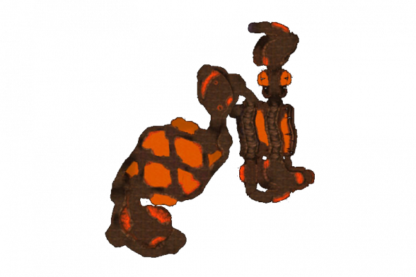
For this guide, we are going to use the following image:
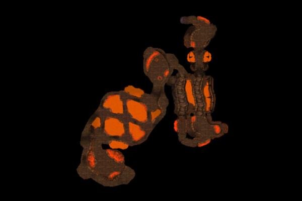
Go ahead and download it and work along with me if you like!
The Basics of GIMP
Alright, you should now have your image open and ready to go inside GIMP. First off, you need to learn some basics on how to use GIMP:
- The many ways to select
- Moving, removing, resizing, and cropping
- What are layers? How do we use them?
The many ways to select
On of the most powerful thing about GIMP is it’s selection tool ability. You have many options, and I’m going to briefly talk about each, how they work, and what you might use them for. Selection tools can be found under Tools –> Selection Tools
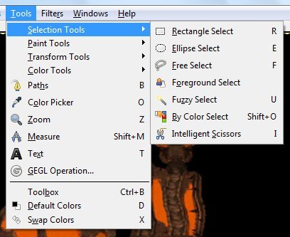
- Rectangle/Elipse/Free Select: These tools allow you to select broad or large parts of your text quickly and easily. It is difficult to use any of them with great precision, however, but they can be great for select an area to crop around or a large area that you want to remove before moving to finer tools.
- Foreground Select: This tool is a bit complicated, a video on how it works can be seen here.
- Fuzzy Select: With Fuzzy Select, you click on a region of a certain color that you want to select. It will select everything of that color touching the place you clicked (so it won’t for example get background inside loops such as letters). It can be very good for removing backgrounds.
- By Color Select: Like Fuzzy Select, only it finds everything of that color throughout the image, even if it’s not touching. This can be problematic if you image contains the same colors as the background.
- Intelligent Scizzors: These are a little like Fuzzy Select, in that they try to be “smart” about selecting. We aren’t going to go into these here, but they are worth playing around with.
Moving, removing, resizing, and cropping
This is the meat of manipulating your image. Most of this is done with the tools under the “Transform Tools” menu:
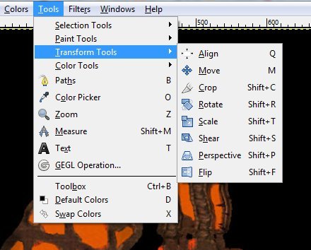
Most of these tools are fairly self-explanatory – they allow you to manipulate whatever portion of the image you have selected, or even entire layers. If you are more interested in changing the image as a whole, you want to look at the “Image” menu:
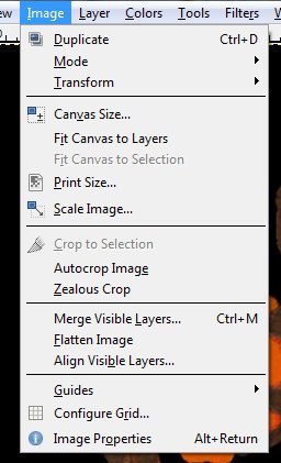
I’m not going to go over this menu in detail, either, but this is where you can find overall image changing options.
What are layers? How do we use them?
The ability to work in layers is very useful in GIMP. This allows us to have a separate layer for our text if we want it, or for other images added on top of the background image or map, and to move them around without harming the background.
So what are layers? Think about several sheets of transparency paper. Each paper has something drawn on it – that covers up the sheet behind it, but only where something is drawn. That’s what each layer in GIMP is like.
How do we use these layers? As I mentioned above, you can use layers to add text on top of your image or map. Take a moment to look at the “Toolbox”, the long rectangular window which appears on the left of your image window in GIMP:
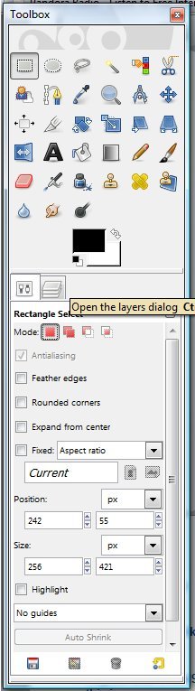
In between the two boxes that make up the Toolbox, you will see that there is another tab. Click this tab to view the Layers tab:
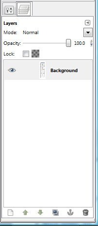
This tab will show you all of the layers currently in the image. You can name each layer, make it partially or completely transparent, hide a layer, merge layers, and more from this pane. I won’t go into detail here, but you will be learning how to use this functionality as we progress through the guide.
Removing Backgrounds
Now that you are at least somewhat familiar with the basics of GIMP, we’re going to start modifying our base image. The first step is removing that nasty black background. A lot of maps you will find have that, and it doesn’t look nice on WoW-Pro since our site is white. Fortunately, with GIMP, it’s easy to make that background transparent, so it blends nicely with whatever site you choose to post your image on!
There are two basic ways to remove the background. The first is to use select by color, and the second is to use fuzzy select. Select by color is nice when the background color is NOT present elsewhere in your image. It’s good because it gets the bits of background that are inside loops or otherwise not touching the bulk background. Both of these conditions make it the best choice for the example image we are using.
Simply choose “select by color” from the menu or toolbox and click on the background of the image:
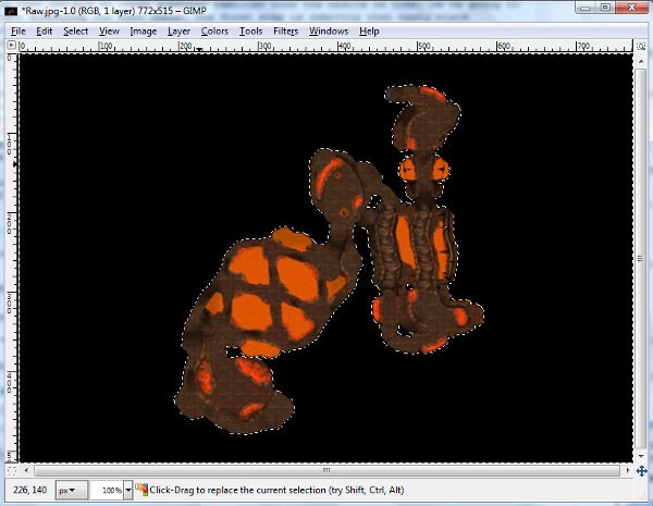
As you can see, the black background portion of the image has become highlighted.
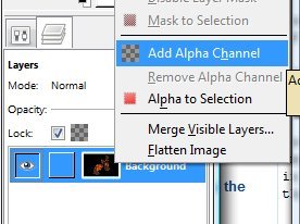
Now, before we delete the background, we need to first change this layer of our image so that it will be transparent. In your Toolbox, click the layer tab (as shown in the previous section). Right click the “Background” layer (the default name for the first layer of your image) and select “Add Alpha Channel”.
Once the alpha channel is added, you only need to hit “delete” and the background of the image will be removed. You’ll see a gray checkered pattern, this is GIMP’s way of showing transparency.
You’ve just completed the first step in making a professional-looking map! One note – JPEG files cannot handle transparency. I recommend using a PNG or GIF file format when saving your files. Simply add a .gif or .png to the end of the name when you save it to use these formats.
Our image so far:
Adding Notes
Now you have a map image, but it’s not very useful yet. You need to add notes. We’re going to do this using the typing tool. Simple choose “Text Tool” from the menu or toolbox and click somewhere on the image where you would like to place text.
Once you have a text field, you can type what you want and then change the font, size, color, and style to fit the feel you are looking for (these options are located on the text tab that should be available now on your toolbox). Remember, readability is the most important thing, not fancy colors, so make sure the person using your guide can read it. We’ll discuss some tricks to help your text stand out in the next section.
Every time you create a new text field, GIMP creates a new layer for that field. That’s important to remember, and is useful in the next few sections when we do some fancy things to this text.
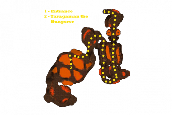
For now, here’s an example of our image with some text on it:

As you know, in many of Jame’s guides, he uses not only text and numbers but also symbols, such as a circle, a large filled area, or a shaded region, to help denote drop areas and mob patrol paths. You should do this on a fresh layer rather than paint directly onto the background. To do this, simply go to the layers window and click the new layer button in the bottom left corner.
To create circles or other shapes, I would suggest using the Ink Tool. To create a large area with a transparent fill, use the Paintbrush Tool to draw the outline. Once it is drawn, you can fill it in with the Bucket Fill tool, and can adjust the opacity so it can be seen through.
Here’s our image so far, it should use everything you have learned about up to this point:
Adding an Outline
Remember when I talked about how important readability was? Well, here is the biggest thing you can do to improve both readability and the style of your notes – make the text a bold, light color surrounded by a black outline.
The process for creating an outline around your text is a bit non-intuitive.
- First, select the layer with your text in it and select the text tool from the menu or toolbox.
- On the toolbox pane, click the text options tab (it should be the tab on the left). At the bottom of the window, there should be a button that says “Create path from text”. Click it.
- Now we need to create a new transparent layer. Go to the layers tab and click the new layer button in the lower left corner. You can call the layer whatever you want, I suggest “Outline”. Make sure this layer is BELOW the layer with your text on it.
- Next we need to make a new window on your toolbox, called the path window. If you are putting outlines on a lot of things, you’ll definitely want this window to be easily accessible. Go to the layers tab of your toolbox. You should see a little sideways triangle in the upper right corner. Click it – in the menu that opens, go to Add Tab > Paths.
- Once the window is open, you should see a list of any paths you have created (at this point there should just be one – it will be named after the text that you made the path from). Right click the path you want to turn into an outline. Select “stroke from text”. The window that pops up has several options that you can play with in order to get the thickness you want from your text outline.
You can add outlines to the other “notes” we learned how to create in a similar way. The only difference is that, instead of simply choosing “create path from text” like we did above, we need to create the path a different way. The easiest way is to select the object you want to outline, and then create a path from the selection. To create the path once your object is selected, simply go to the Paths tab of your toolbox and click “Selection to Path” in the lower right corner. After that, you can stroke from the path just like we did in the text example.
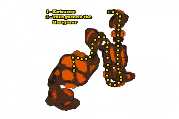
Note: Occasionally when creating text outlines, GIMP makes weird, sharp protrusions from the text. Usually these are easily erasable, but if anyone knows why this happens and how to fix it, please leave a comment.
Here’s our image with outlines added:
Adding a Drop Shadow
This last bit is just a style option that you can add if you want to. It might improve readability a little but, but isn’t really necessary. But if you want to, you can make your notes and even the image itself have a nifty drop shadow. This is actually very simple to do.
- Select the region of your image that you want to give a drop shadow. I typically combine all text and notes into one layer, and the background into a separate layer. This way I can fuzzy-select click the blank portion of the image, then invert my selection to get all the notes at once.
- Go to Filters –> Light and Shadow –> Drop Shadow.
- The window that pops up will allow you to specify the offset and the size of your shadow. Play with it until you get the look you desire. I usually use a bigger shadow for the background and a small one for notes.
Here is an example of our image with a drop shadow added:

Thank you for reading these tips. If you have any useful tips you’d like to share, you can Leave a comment.